


How To Choose The Perfect Color Palette For Your Qatari Home
It is exciting to build your Qatari home journey wherein every decision about furniture and fixtures plays an important role in fashioning a space that is not only comfortable but also opulent. The most far-reaching decision you have to make would be picking the right color palette.
The colors you choose, according to the best interior design company in Qatar, determine the mood, aesthetic, and even apparent size of a room. In the home of a Qatari, so often blending ancient and modern architecture and interiors, the colors you choose may be sympathetic to that unique cultural backdrop or provide a strong modern contrast.
In this blog, we examine the important factors to consider while selecting the right palette for your Qatari house. From how local culture and climate might impact color choice, to combining the best of modern trends with traditional appeal, this guide will take you through actionable insights that shall help make informed decisions.
Understanding The Cultural Significance Of Colors
Colors in Qatari culture possess symbolic meanings and thus reflect the deep influence that nature, religion, and history this backdrop has had on the Qatari people.
Designers will want to consider the color palette of choice not only for aesthetics but also out of cultural understanding of Qatari connotations and their respect for local tradition.
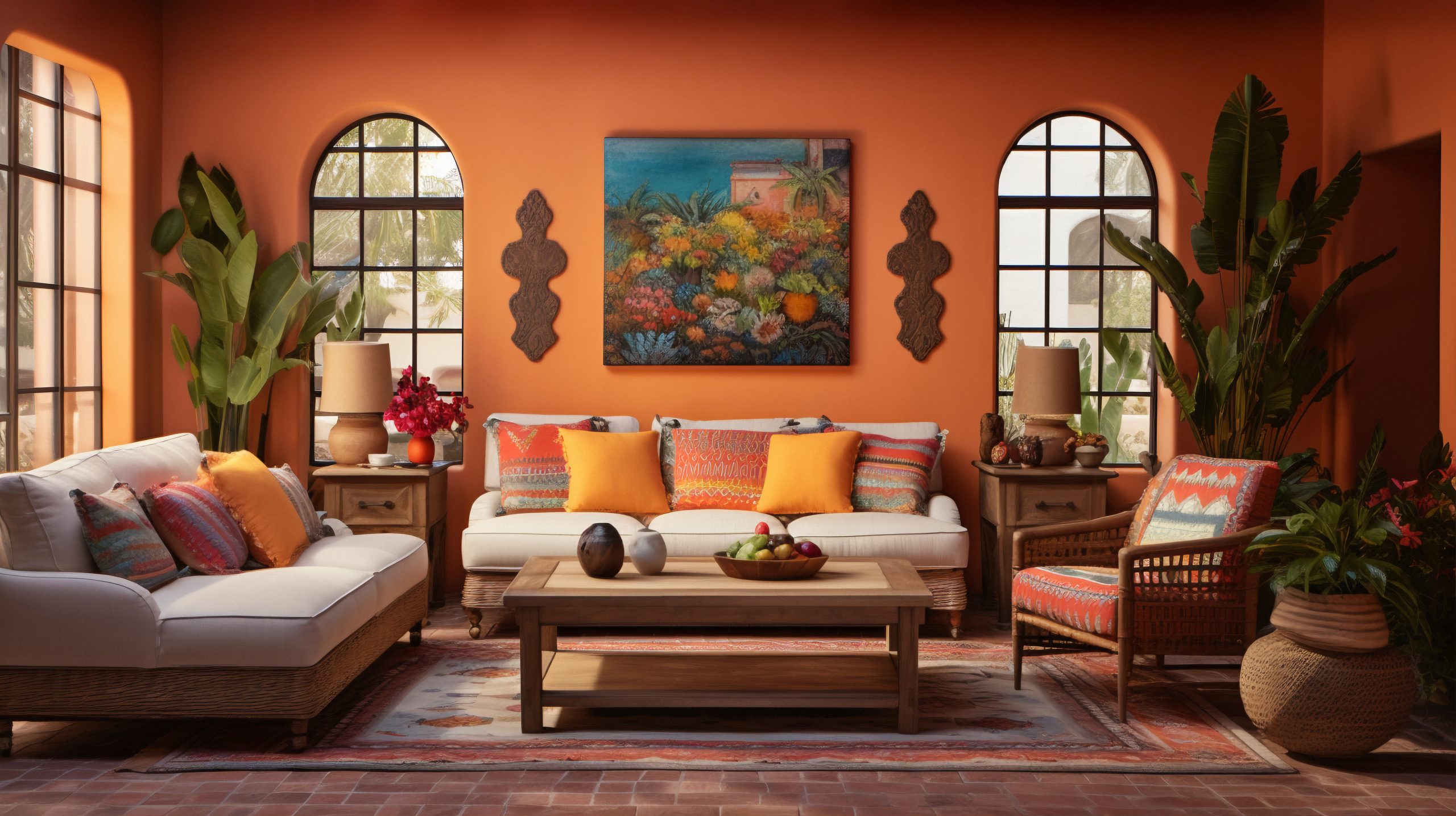
1. Earthy Tones: A Nod To The Desert Landscape
The desert of Qatar defines the outline of the country, and its earthy tones have been reflected in many traditional home designs. Shades of beige, sand, terracotta, ochre, and others bring into a household natural warmth, making the place quiet and smooth. It’s not only a reflection of the outdoors but also colorfully soothing and comfortable.
2. The Glory Of The Colors Of Kings
Historically, colors like gold, deep red, and royal blue are synonymous with wealth and prestige in the Gulf. Adding that to one’s home, whatever way, automatically gives it an extra edge of opulence and grandeur. For instance, a royal blue accent feature in the living room or a deep red feature in the dining area creates focal points that pull the eye and create depth.
3. White And Neutrals: Symbols Of Purity And Simplicity
White and other neutral tones are popular not only because of their versatility in design but also for what they represent: purity and peace. Neutral colors may be used extensively in your Qatari home to create open, light areas. For example, white walls would amplify natural light into Qatari homes, which is ample, especially during the day, and make spaces feel more spacious and airy.
Climate Considerations: Keeping Cool And Comfortable
Another vital determinant factor in the selection of colors is Qatar’s hot climate. The right colors can help maintain an even temperature inside your home and, thus, allow comfortable living.
1. Light Colors To Reflect Heat
In the case of reflecting sunlight and keeping your home cooler, white, cream, and pastel shades are just perfect options. These shades work particularly well in rooms receiving plenty of direct sunlight, such as a living room or bedrooms with large windows facing the sun. Moreover, light colors can reduce artificial cooling, which may be both energy-efficient and economical.
2. Cool Tones For A Refreshing Ambiance
Cool tones, much like the blues, greens, and greys mentioned above, can be very refreshing and calming. This is especially enticing under Qatari heat. The colors can hint at a sense of water or a cool breeze, psychically playing against the heat outside. Try using these tones for bedrooms and bathrooms to easily create a faraway escape right in your own home.
HOT: Balancing Tradition With Modernity

The Qatari homes are the perfect blend of traditional and modern features. Therefore, there needs to be a balance in the case of color selection to maintain both these aspects.
1. Apply The Traditional Patterns And Colors
Traditional Qatari patterns, geometrical designs, and intricate motifs can be aesthetically worked into a modern color palette.
For example, the soft modern background could be done in a color like a dove grey or soft teal and then have traditional patterns worked in something brighter and bolder in color for contrast. This way, you stay connected to your heritage and enjoy the newest trends in modern design.
2. Cultural Minimalism In Modern Times
Of course, you can make traditional statements even if your overall design is more minimalist. Imagine an essentially white or neutral background spiced up by a few choice accent colours-for example, a bright red attention-grabbing cushion a mirror framed in gold, or even a deep blue rug that adds colour. It is these touches that give character and cultural depth to a modern, streamlined space.
Room-By-Room Palette Planning
Each room in your home has a different purpose, and your color choices should reflect not only the function but also the atmosphere you wish to create in each.
1. Living Room: Warm And Inviting
The living room is the heart of the house and the place where family and guests merge, so you want to use inviting, warming colors: soft beige, rich terracotta, or warm gold.
These colors will help add relaxation, a sense of comfort, and easygoing vibes to a room, creating a secure and laid-back space—one that just begs for people to kick back and unwind. To add depth and interest, you could use accent colors with the addition of cushions, curtains, or artwork in those tones.
2. Bedroom: Calm And Restful
The bedroom is about tones that are not active and create a restful environment. Soft, cool colors like pale blue, lavender, or sage green provide the best setting to sleep in. Warmer tones can work, too-one might try muted shades like blush pink or soft peach for a tranquil feel without being over-stimulating.
3. Kitchen: Bright And Energetic
The kitchen is a room of action and energy; hence, it is also a good avenue to try bolder and brighter colors. Sunny yellows, vibrant greens, or even a deep, rich blue can really energize the space and turn it into a focal point within your home. Think about including those colors on cabinetry, backsplashes, or perhaps a feature wall, giving an element of animation and hospitality to the kitchen.
4. Bathroom: Clean And Serene
Bathrooms are all about being light and fresh with colors. Whites, light greys, or pale blues create an atmosphere that is clean and serene for self-care.
These can be complemented by natural elements like wood or stone to further enhance the tranquility indoors, pushing your home closer to being a spa. How to Combine Colors Successfully
Choosing a color palette is more than just choosing a few favorite colors. Here are some tips to help you combine colors successfully in your Qatari home:
1. The 60-30-10 Rule
This traditional rule of interior design helps to balance a color scheme. Employ a main color for 60% of walls and the dominant hue of large furniture pieces, use a secondary color for 30% of upholstery and smaller furnishings, and an accent color for 10% of accessories and decor items. This will make sure that your room feels balanced and harmonized.
2. Use Color To Define Spaces
You can use color to define spaces in open-concept homes. Take, for instance, warm beige in the living area transitioning into cool blue in the dining space, subtly separating the two areas but with flow and harmony.
3. Don’t Be Afraid Of Contrast
A little contrast, however, brings interest to the eye and thereby can make a space way more dynamic. Together, complementary colors, such as blue and orange, purple and yellow, can make a room feel lively with interaction. But always balance the bright with neutrals to avoid making the place overwhelming.
Choosing the perfect color palette for your Qatari home balances art and science, varying from cultural respect to practicality and personal style.
By deciphering the cultural code behind colors, using the climate, weighing the scale between tradition and modernity, and thoughtful room-by-room planning of the color palette, you might create a home not only aesthetically pleasing but deeply reflective of your identity and the unique environment you live in.
Keep in mind, however, that colors will set the tone of your home and show their influence on anything from your mood to how spaces are perceived. Take the time to explore options, consider professional advice where needed, and above all, choose colors that will most make you feel at home.
Read Also:


Leave A Reply